First Month at Igalia
Published 5 years, 3 months pastToday marks one month at Igalia. It’s been a lot, and there’s more to come, but it’s been a really great experience. I get to do things I really enjoy and value, and Igalia supports and encourages all of it without trying to steer me in specific directions. I’ve been incredibly lucky to experience that kind of working environment twice in my life — and the other one was an outfit I helped create.
Here’s a summary of what I’ve been up to:
- Generally got up to speed on what Igalia is working on (spoiler: a lot).
- Redesigned parts of wpewebkit.org, fixed a few outstanding bugs, edited most of the rest. (The site runs on 11ty, so I’ve been learning that as well.)
- Wrote a bunch of CSS tests/demos that will form the basis for other works, like articles and videos.
- Drafted a few of said articles. As I write this, two are very close to being complete, and a third is almost ready for editing.
- Edited some pages on the Mozilla Developer Network (MDN), clarifying or upgrading text in some places and replacing unclear examples in others.
- Joined the Open Web Docs Steering Committee.
- Reviewed various specs and proposals (e.g., Miriam’s very interesting
@scopeproposal).
And that’s not all! Here’s what I have planned for the next few months:
- More contributions to MDN, much of it in the CSS space, but also branching out into documenting some up-and-coming APIs in areas that are fairly new to me. (Details to come!)
- Contributions to the Web Platform Tests (WPT), once I get familiar with how that process is structured.
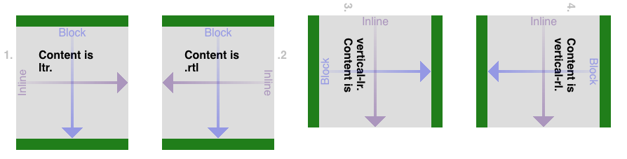
- Articles on topics that will include (but are not limited to!) gaps in CSS, logical properties, and styling based on writing direction. I haven’t actually settled on outlets for those yet, so if you’d be interested in publishing any of them, hit me up. I usually aim for about a thousand words, including example markup and CSS.
- Very likely will rejoin the CSS Working Group after a (mumblecough)-year absence.
- Assembling a Raspberry Pi system to test out WPEWebKit in its native, embedded environment and get a handle on how to create a “setting up WPEWebKit for total embedded-device noobs”, of which I am one.
That last one will be an entirely new area for me, as I’ve never really worked with an embedded-device browser before. WPEWebKit is a WebKit port, actually the official WebKit port for embedded devices, and as such is aggressively tuned for performance and low resource demand. I’m really looking forward to not only seeing what it’s like to use it, but also how I might be able to leverage it into some interesting projects.
WPEWebKit is one of the reasons why Igalia is such a big contributor to WebKit, helping drive its standards support forward and raise its interoperability with other browser engines. There’s a thread of self-interest there: a better WebKit means a better WPEWebKit, which means more capable embedded devices for Igalia’s clients. But after a month on the inside, I feel comfortable saying most of Igalia’s commitment to interoperability is philosophical in nature — they truly believe that more consistency and capability in web browsers benefits everyone. As in, THIS IS FOR EVERYONE.
And to go along with that, more knowledge and awareness is seen as an unvarnished good, which is why they’re having me working on MDN content. To that end, I’m putting out an invitation here and now: if you come across a page on MDN about CSS or HTML that confuses you, or seems inaccurate, or just doesn’t have much information at all, please get in touch to let me know, particularly if you are not a native English speaker.
I can’t offer translation services, unfortunately, but I can do my best to make the English content of MDN as clear as possible. Sometimes, what makes sense to a native English speaker is obscure or unclear to others. So while this offer is open to everyone, don’t hold back if you’re struggling to parse the English. It’s more likely the English is unclear and imprecise, and I’d like to erase that barrier if I can.
The best way to submit a report is to send me email with [MDN] and the URL of the page you’re writing about in the subject line. If you’re writing about a collection of pages, put the URLs into the email body rather than the subject line, but please keep the [MDN] in the subject so I can track it more easily. You can also ping me on Twitter, though I’ll probably ask you to email me so I don’t lose track of the report. Just FYI.
I feel like there was more, but this is getting long enough and anyway, it already seems like a lot. I can’t wait to share more with you in the coming months!