Posts from 2005

Bread, Soup, and Love

Published 18 years, 10 months past

A couple of weeks before Christmas, Kat and I held our annual Bread and Soup Party.  We started it the year we moved into our house, and it’s still going strong.  We’re to the point now of luring attendees from other states: in the past, we’ve had people from New York, Illinois, and Oregon fly in to spend a long weekend and be at the party.  Had you been there this year, you’d have gotten to meet Molly, as well as have a chance to video chat with Andy.  We also got blogged here and there by attendees, all of whom seemed to have a great time.  Our guess is that in the course of the party, close to 90 people passed through our doors.  This is a good turnout, though well below our high of 150 from last year.

Why am I bringing this up?  Because several people, upon hearing about this party from the bloggers and other guests, have expressed interest in holding their own version of the party.  To which I say: hey, you slackers, come up with your own damn party idea!

I’m kidding.  I kid!  You should absolutely feel free to copy the idea, or come up with your own variant.  Here’s the not-quite-a-recipe we follow for this event.

  • We invite just about everyone we know, regardless of how close or far away they live.  In fact, we put an invitation in the mailbox of every house on our block, and it’s a semi-lengthy block, so in many cases we’re inviting people we don’t know.  That’s okay.  The people we know are always welcome to bring people they know, but we don’t.
  • The party has a start time, but no end time.  The format is open house: people come when they can, and leave when they like.  We start at 3:00pm on a weekend day, and usually the last guests are out the door by 9:00pm.  The first year it went a bit later, and people still speak in hushed and shuddering tones of the “Truth or Dare Jenga” game that was played that night.
  • The time of year is important.  Bread and soup in the middle of summer doesn’t work nearly as well as it does in winter.  Being in the Northern Hemisphere, which puts the holidays in winter, is a bonus, but not crucial.
  • We state right on the invitation, and as many times as we can think to do so, that guests should bring nothing but themselves and some good cheer.  No gifts, no bottle of wine, no food.  We haven’t yet started a policy of turning away gift-bearers, but we’re considering it.
  • Children are welcome.  They were even before we had our own, but this is key if you want to draw families.  Which we do.
  • We get help from our friends.  We have cooks beforehand, and a cleanup crew after.  This is essential, because otherwise we’d never be able to manage it.
  • We use paper plates—nice heavy laminated paper, but paper nonetheless—and styrofoam cups with plastic spoons for the soups.  This makes cleanup a whole lot easier, plus it means we don’t have to buy place settings for 128, or worry about dropped bowls shattering.  We’re seriously thinking about going to small styrofoam bowls next year, but the principles basically the same.

Okay, so those are the parameters.  The content, though, is what brings ’em in:  we provide five pots of soup and from five to seven loaves of bread, each one cooked entirely from scratch.  Here’s this year’s lineup.

  • Soups:
  • Breads:
    • Cornbread
    • Challah
    • Eggnog bread
    • Oatmeal bread
    • Gingerbread (the real stuff, not the thin house-building kind)

To make things extra-tasty, we try to coordinate soups and breads.  For example, this year we made gingerbread because it seemed like a good match for the pumpkin soup.  (And wow, was it ever.)  Similarly, the cornbread was an excellent partner to the black bean soup.

Remember: these are all cooked from scratch.  The closest we’ve gotten to pre-made soup was the year we had clam chowder, when we bought the clams in cans.  The  breads are all done from first principles, even the cornbread, which is made with real cornmeal and not a bunch of boxes of Jiffy corn mix.  Nothing wrong with Jiffy, which I love, but it just doesn’t yield the kind of hearty, rustic cornbread we were after.

This sounds like a lot of work, and it is, but that’s why I made the point about having friends help.  In the past few years, we’ve set things up so that each pot of soup has its own sous chef.  (This year, the soups were actually chefs’ choice, so that made them rather less sous-y, I admit.)  Cooking starts around 10:00am, with all of us gathered in the kitchen chatting, laughing, tasting, and adjusting as we cook.  It’s noisy and cozy and smells amazing, and honestly is more fun than the party itself, at least for us.  It’s a shame that the cooking experience doesn’t scale up to a full party, or else we’d just do that.

In addition to the soups and breads, we also set up a cheese board with several different varities, crackers, summer sausages, and grape clusters.  For drinks, we provide eggnog (both spiked and unspiked) and hot mulled apple cider; and for dessert, a selection of petit fours and candies.  But those are reflections of our profound yuppiehood, and not really integral to the core party experience.

Once everyone’s left besides the cleanup crew, we start washing and storing any leftovers (this year, there were hardly any) and doing a post-mortem of which offerings were popular, and why.  This stage is a lot quieter and more reflective than the cooking part, but it’s no less enjoyable.

I’ll throw open the comments to observations from guests from this and previous years, and questions from anyone who’s curious to know more. 

Tables to Bar Graphs

Published 18 years, 11 months past

In “Bar Graphs With Style“, I took a set of nested lists and some divs and turned them into a vertical bar graph using CSS.  Jan Brašna pointed out that the actual information I was presenting would probably be better represented as a table instead of nested lists.  I don’t think there’s anything wrong with using the lists, but I do agree with him that a table might be a better base represention of the data.  Maybe you agree.  If so, then here you go: CSS Vertical Bar Graphs using a table as the markup basis.

The demo works fine in Safari, and in Firefox I got it to work by explicitly setting the table element to display: block (when I left it as display: table, the bars were badly misplaced).  In IE/Win, everything’s fine except for the actual placement of the bars; they’re fine as a group but way out of place.  I think the IE/Win problem is a simple refusal to give a table element dimensions when all of its descendants have been positioned, no matter what display value it’s given.  Perhaps some intrepid soul can figure out a way to defeat this. [Update: some intrepid soul did, and the demo has been updated; it now works in IE/Win as well as most other browsers.]

(I considered the idea of positioning all the bars with top instead of bottom, thus sidestepping the table-sizing problem, but that would mean a different way to place the ‘ticks’ and in the end it was different enough from what I’d done that I just couldn’t be bothered.  Feel free to run with the idea, though, or come up with a better one.)

I must admit that when I first assembled this table-based chart demo, it was with some trepidation.  From a CSS point of view, of course, it doesn’t matter what elements you position, nor how: a td is no different than a div or any other element.  Historical browser behavior, though, has been to put table markup into its own special category and treat it as being extra-special—as witness IE/Win’s handling of the original demo.  I was honestly afraid that, in overriding the display values for table elements (by positioning them), I’d crash a browser.  So far, no crashes, but proceed at your own risk!


Bar Graphs With Style

Published 18 years, 11 months past

A lot of the time, when I’m sharing a technique or effect I’ve devised, I’ll say something like “I doubt I’m the first to think of this…” or “it may not be original, but it’s original to me…”.  This might strike some as an annoying quirk, some sort of pseudo-modesty that I should either embrace fully or just drop already.

However, I do it because I know it’s true.  Even some of the most radical experiments I’ve published, like those on css/edge, were prefigured or anticipated by others.  I didn’t steal anyone’s ideas, of course.  Every one of those demos was an original creation born of my knowledge and thinking.  They just weren’t necessarily the very first instance of those techniques ever published anywhere.  Other ideas, like Universal Child Replacement, were devised before I hit upon them but were never documented.

I bring this up because the door swings both ways: from time to time, I see someone else publish a technique or idea that I’d had but never documented.  A recent case in point was the appearance of “CSS for Bar Graphs” at Apples to Oranges, which showed a vertical bar graph created out of CSS and a list.  I’d done something very, very similar almost three months before the AtO article’s publication date while creating an invoice-tracking system for myself, and never gotten around to publishing an example.

This almost certainly means that they and I were creating basically the same thing at the same time.  Who got the idea first?  Who cares?  It’s a nifty idea no matter who thought it up.  Plus it’s a near-certainty that somebody else did it long before three months ago, and never got around to documenting it.

I often wonder how many really cool techniques and ideas are lost simply because the inventors don’t have the time or energy to publish them.

Since my approach varies a bit from AtO’s, I’ve put up a css/edge demonstration for people to poke.  The major difference is, I think, my use of empty divs to create the horizontal strata instead of a background image.  This let me have strata that were scaled to the figures being output.  For example, if the strata are increments of $10,000 and the highest bar is $55,055, then I can write out enough “bar divs” to make the top of the chart $60,000.  If the tallest bar only goes to $38,522, then I can stop at $40,000.

This also meant calculating and writing out the bars’ heights as inline styles.  What you see in the markup of my demo is the end result of all that back-end calculation.  There are doubtless better ways to go about creating the strata and setting the bar heights, most obviously using DOM scripting to write in said bar divs instead of dirtying up the XHTML with them.  The same would be true for the inline heights of the bars themselves, which could be dropped in favor of dynamic setting.  Heck, you could even make it so the chart could be zoomed in or out.

Someone else can do the necessary scripting if they like; I’m content to get the example out there, however late to the party I may be.  The more such examples there are, the better.

Followup: Tables to Bar Graphs, in which the same chart is created out of a table instead of nested lists.


Full Freight

Published 18 years, 11 months past

I recently wrote that the font Freight Micro had broken Unicode references.  It turns out that I was basing my comments on a beta version of the font without realizing it.  The designer of the Freight family was good enough to provide me with a copy of the final version of the font, which I tested, and I’m delighted to report that it does not suffer from the same problem.

So my deepest apologies for any misinformation I may have spread. If you see anyone referencing my previous post on this topic, please point them to this one.  Thank you.

  • Full Freight was published on .
  • It was assigned to the Mac category.
  • There have been no replies.

Adium: Chatting With Style

Published 18 years, 11 months past

Tim Bray, that dashing man-about-town, recently sang the praises of Adium, a multi-service chat client for OS X.  I’d tried it a while back, and been only marginally impressed.  At the time, its presentational inflexibility was too annoying for me to take it seriously.  Okay, yes: it was a damn sight better than Messenger for OS X, which is the only reason I even kept it on my hard drive.  But I hardly ever log onto MSN any more, as everyone I know is on AIM.  So I’d stuck with iChat AV.

Still, Tim’s word is always gold (or at least high-grade palladium) with me, and he said the magic words (“highly skinnable”), so I downloaded the latest copy and poked around for a bit.

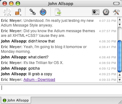
Boy howdy!  Adium has definitely come a long, long way since last I visited.  You can change the appearance of your chat sessions (with “message themes”), the dock icons, the contact list, and much more.  Since none of the default message themes really did it for me, I went looking for others.  There are quite a few available at the Adium Xtras site, but none of them were really what I wanted either.  In iChat, I cranked the graphic frippery down to zero so that the chat sessions were as compact as possible, but I still had the text look nice.  If I could recreate that in Adium, it would make the migration much, much simpler.

So I dug into the package contents of a promising message theme… and found out that themes are based on nothing more than XHTML and CSS.

Seriously.  The entirety of an Adium chat window is an XHTML document that’s being dynamically updated via DOM scripting—all of it pumped through WebKit, of course.  In creating a message theme, you define what markup will be used, and write CSS to style it.  You can even define variants on your theme by writing additional style sheets.

So with some quick hacking, I not only radically improved the markup generated during a chat (the markup I saw in the packages I downloaded was, um, sub-optimal), but I basically replicated my old iChat theme with some simple CSS.  And then I created some variants that slightly modify it in various ways, mostly to prove that I could.

I’m now wondering if I could write and attach JavaScript that would make chat sessions even more interactive, more robust.  (Update: Phil says yes.)  Click on a line to copy the whole line to the clipboard, say, or dynamically change the in-session presentation by hitting a button.  Adium may block that kind of thing, but if not, then it’s a chat client extensible beyond anything I’ve so far imagined.

And given how much I love to tinker with my software, that’s like waving a bulging suitcase of money in front of a senator.

Granted, there are some things I’d like to change.  For example, the markup you define in a theme is not used in saving the chat log.  In a log, you just get some basic markup with a case of classitis and very, very poor semantics.  It would be a lot cooler if you could define the log markup (or the log just used the markup you generate during a chat session) and the CSS to present it.

A chat log is also something that, it seems to me, cries out for a microformat.  The markup I’m using for my theme is also a first effort in that direction, recycling some other microformats’ concepts (I stole a bit from hCalendar and am planning to graft in some hCard as well) and setting up some basics.  If I can take this far enough, I might consider pushing to upgrade the markup Adium generates in its logs.  They’re dropping a lot of information on the floor when they write out the logs, and I think that’s a shame.

But then, I can make the effort to fix that and actually have a chance of it paying dividends.  The joys of open source, you know?

I’ll still use iChat AV for videoconferences, which are an essential tool for family cohesiveness when I’m on the road, as well as to keep close to my father down in Florida.  For text, though—which accounts for at least 90% of my instant messaging activity—Adium is my new chat buddy.


Tax Relief

Published 18 years, 11 months past

When you own your own business (or just work independently), there’s an extra-special feeling of frisson when the mailman arrives bearing an envelope from the Internal Revenue Service.  I recently got one, though, that made me laugh out loud, despite being about the possible loss of my third-quarter payment.  No, really.  It still makes me chuckle every time I read the second paragraph:

On Sunday, September 11, 2005 an accident occurred on the San Mateo Bridge near San Francisco, California involving a courier transporting payments to an IRS Payment Processing Site.  A truck carrying tax payments overturned, causing approximately 30,000 Form 1040ES quarterly estimated tax payments to be ejected into the San Francisco Bay.

And people say the IRS has no sense of poetry.


Pencilled In

Published 18 years, 11 months past

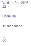
A followup to my previous post: thanks to the nearly impossible to find Character Palette (and thanks to Todd Dominey for instructions on how to enable and use it), I was able to determine the problem and restore my editing pencils.  It turns out that a beta copy of the font “Freight” was what caused the problem.  This beta copy of Freight was for some reason convinced that Unicode 9999 is the reference to a Z-caron instead of a pencil symbol.  It didn’t do this for 9998 or 10000.  Just 9999.

So I removed “beta Freight”, and the pencils returned.  Thanks to everyone who helped me out!

Update: there’s more to the story, namely that the copy of Freight in question was a beta, and not the final release, and the final release doesn’t have the problem that bit me.  I’ve edited this post to reflect that fact.


Pencilled Out

Published 18 years, 11 months past

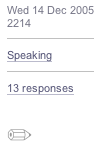
Pretty much nobody but me ever sees this, but when I’m logged into meyerweb’s copy of WordPress (basically, all the time) I see a little pencil icon next to entries and comments.  It’s the “click here to edit this” link, and I generate it using the following markup:

<a href="[...]">&#9999;</a>

Ah, Unicode.

The problem is that at some point in the recent past, my OS X 10.3.9 laptop started rendering that character as a Z with a set of rabbit ears on top, whereas my OS X 10.3.9 desktop machine still shows the pencil.  I can only assume this is due to a recent software installation on the laptop, possibly one that stuck in a badly structured font or something.  Or else an update messed up the Unicode pointers.

Whatever the cause might be, does anyone out there know if there’s a way for me to figure out what font is being used to generate the funky Z, or how I might otherwise be able to track down and destroy it and get the pencils back?  Because it’s driving me frickin’ crazy.

Update: the problem is now fixed, as described in the followup entry.


Browse the Archive

Earlier Entries