Posts in the Personal Category

From ABC’s to 9999999

Published 1 year, 8 months past

The other week I crossed a midpoint, of sorts: as I was driving home from a weekly commitment, my iPhone segued from Rush’s “Mystic Rhythms” to The Seatbelts’ “N.Y.  Rush”, which is, lexicographically speaking, the middle of my iTu —  oh excuse me, the middle of my Music Dot App Library, where I passed from the “M” songs into the “N” songs.

See, about a year or so ago, I took inspiration from Kevin Smokler to set about listening through my entire music library alphabetically by song title.  Thus, I started with “ABC’s” by K’naan and will end, probably in a year or so, with “9999999” by Mike Morasky (a.k.a Aperture Science Psychoacoustics Laboratory).

Every time I have to drive my car for more than a few minutes, I’ll plug in my iPhone and continue the listen from where I left off.  This mainly happens during the aforementioned weekly commitment, which usually sees me driving for an hour or so.  I also listen to it while I’m doing chores around the house like installing ceiling fans or diagnosing half-dead Christmas light strings.

This sort of listen is, in many ways, like listening to the entire library on shuffle, because, as Jared Spool used to point out (and probably still does), alphabetically sorting a long list of things is indistinguishable from having it randomized.  For me, the main difference between alphabetical and random is that it’s a lot easier to pick back up where you left off when working through alphabetically. (Yes, Music Dot App should do that automatically, but sometimes it forgets where it was.) You can also be a lot more certain that every song gets a listen, something that’s harder to ensure if you’re listening to a random shuffle of a couple thousand tracks and your software loses its place.

There are other advantages: sometimes, artists will use the same song title, and you get interesting combinations.  For example, there was “America”, which gave me a song by K’naan and then a same-titled, but very different, song by Spinal Tap.  Similarly, there are titular combinations that pop out, like  “Come On” by The Goo Goo Dolls, “Come On In, The Dreams Are Fine” by Dee-Lite, and “Come On Over” by Elana Stone.

Some of these combinations groove, some delight, some earn the stank face, and some make me literally laugh out loud.  And some aren’t related by title but still go together really, really well.  A recent example was the segue from The Prodigy’s “Narayan” to Radiohead’s “The National Anthem”, which sonically flowed just right at the switchover, almost like they’d been composed to have that effect.  It made this old long-ago radio DJ smile.

I say I took inspiration from Kevin because my listen has a couple of differences to his:

  • Kevin has a “no skips, ever” rule, but I will skip songs that are repeats.  This happens a lot when you have both live and studio albums, as I do for a few artists (particularly Rush), or have copied tracks for lightly-engineered playlists, as I have a few times.  That said, if I have a song by one artist and a cover of that song by another, I don’t skip either of them.  For remixes or alternate recordings of a song by the same artist, I generally don’t skip, unless the remix is just the original song with a vaguely different beat track.
  • I filtered out most of my classical content before starting.  This is not because I dislike classical, but because they tend to sort together in unrelenting clumps  —  all of Beethoven’s and Mozart’s symphonies one after another after another, for example  —  and I wanted a varietal mix.  I did keep “classical” albums like Carreras Domingo Pavarotti in Concert and Carmina Burana because they have normal-length tracks with titles that scatter them throughout the sort.  The same reasoning was used to retain classic film and TV scores, even if I was stretching it a bit to leave in The Music of Cosmos (the 1980 one), which prefixes all its tracks with Roman numerals… but each track is a medley, so it got a pass.  The whole-album-in-a-single-MP3 The Music of Osmos, on the other hand, did not.

All that said, I have a much shorter road than Kevin: he has a library of over twelve thousand tracks, whereas my slightly-filtered library is just shy of 2,500 tracks, or right around 160 hours.  The repeated-song skips knock the total time down a bit, probably by a few hours but not much more than that.  So, figure at an average of 80 minutes per week, that’s about 120 weeks, or two years and four months to get from beginning to end.

And what will I do when I reach the end?  Probably go back to better curate the sorting (e.g., configuring Soundgarden’s “4th of July” to be sorted as “Fourth of July”), create a playlist that cuts out the repeats ahead of time, and start over.  But we’ll see when I get there.  Maybe next time I’ll listen to it in reverse alphabetical order instead.

Peerless Whisper

Published 1 year, 9 months past

What happened was, I was hanging out in an online chatter channel when a little birdy named Bruce chirped about OpenAI’s Whisper and how he was using it to transcribe audio.  And I thought, Hey, I have audio that needs to be transcribed.  Brucie Bird also mentioned it would output text, SRT, and WebVTT formats, and I thought, Hey, I have videos I’ll need to upload with transcription to YouTube!  And then he said you could run it from the command line, and I thought, Hey, I have a command line!

So off I went to install it and try it out, and immediately ran smack into some hurdles I thought I’d document here in case someone else has similar problems.  All of this took place on my M2 MacBook Pro, though I believe most of the below should be relevant to anyone trying to do this at the command line.

The first thing I did was what the GitHub repository’s README recommended, which is:

$ pip install -U openai-whisper

That failed because I didn’t have pip installed.  Okay, fair enough.  I figured out how to install that, setting up an alias of python for python3 along the way, and then tried again.  This time, the install started and then bombed out:

Collecting openai-whisper
  Using cached openai-whisper-20230314.tar.gz (792 kB)
  Installing build dependencies ...  done
  Getting requirements to build wheel ...  done
  Preparing metadata (pyproject.toml) ...  done
Collecting numba
  Using cached numba-0.56.4.tar.gz (2.4 MB)
  Preparing metadata (setup.py) ...  error
  error: subprocess-exited-with-error

…followed by some stack trace stuff, none of which was really useful until ten or so lines down, where I found:

RuntimeError: Cannot install on Python version 3.11.2; only versions >=3.7,<3.11 are supported.

In other words, the version of Python I have installed is too modern to run AI.  What a world.

I DuckDucked around a bit and hit upon pyenv, which is I guess a way of installing and running older versions of Python without having to overwrite whatever version(s) you already have.  I’ll skip over the error part of my trial-and-error process and give you the commands that made it all work:

$ brew install pyenv

$ pyenv install 3.10

$ PATH="~/.pyenv/shims:${PATH}"

$ pyenv local 3.10

$ pip install -U openai-whisper

That got Whisper to install.  It didn’t take very long.

At that point, I wondered what I’d have to configure to transcribe something, and the answer turned out to be precisely zilch.  Once the install was done, I dropped into the directory containing my MP4 video, and typed this:

$ whisper wpe-mse-eme-v2.mp4

Here’s what I got back.  I’ve marked the very few errors.

[00:00.000 --> 00:07.000]  In this video, we'll show you several demos showcasing multi-media capabilities in WPE WebKit,
[00:07.000 --> 00:11.000]  the official port of the WebKit engine for embedded devices.
[00:11.000 --> 00:18.000]  Each of these demos are running on the low-powered Raspberry Pi 3 seen in the lower right-hand side of the screen here.
[00:18.000 --> 00:25.000]  Infotainment systems and media players often need to consume digital rights-managed videos.
[00:25.000 --> 00:32.000]  They tell me, is Michael coming out?  Affirmative, Mike's coming out.
[00:32.000 --> 00:45.000]  Here you can see just that, smooth streaming playback using encrypted media extensions, or EME, with PlayReady 4.
[00:45.000 --> 00:52.000]  Media source extensions, or MSE, are used by many players for greater control over playback.
[00:52.000 --> 01:00.000]  YouTube TV has a whole conformance test suite for this, which WPE has been passing since 2021.
[01:00.000 --> 01:09.000]  The loan exceptions here are those tests requiring hardware support not available on the Raspberry Pi 4, but available for other platforms.
[01:09.000 --> 01:16.000]  YouTube TV has a conformance test for EME, which WPE WebKit passes with flying colors.
[01:22.000 --> 01:40.000]  Music
[01:40.000 --> 01:45.000]  Finally, perhaps most impressively, we can put all these things together.
[01:45.000 --> 01:56.000]  Here is the dash.js player using MSE, running in a page, and using Widevine DRM to decrypt and play rights-managed video with EME all fluidly.
[01:56.000 --> 02:04.000]  Music
[02:04.000 --> 02:09.000]  Remember, all of this is being played back on the same low-powered Raspberry Pi 3.
[02:27.000 --> 02:34.000]  For more about WPE WebKit, please visit WPE WebKit.com.
[02:34.000 --> 02:42.000]  For more information about EGALIA, or to find out how we can help with your embedded device needs, please visit us at EGALIA.com.  

I am, frankly, astonished.  This has no business being as accurate as it is, for all kinds of reasons.  There’s a lot of jargon and very specific terminology in there, and Whisper nailed pretty much every last bit of it, first time in, no special configuration, nothing.  I didn’t even bump up the model size from the default of small.  I felt a little like that Froyo guy in the animated Hunchback of Notre Dame meme yelling about sorcery or whatever.

True, the output isn’t absolutely perfect.  Let’s review the glitches in reverse order.  The last two errors, turning “Igalia” into “EGALIA”, seems fair enough given I didn’t specify that there would be languages other than English involved.  I routinely have to spell it for my fellow Americans, so no reason to think a codebase could do any better.

The space inserted into “WPEWebKit” (which happens throughout) is similarly understandable.  I’m impressed it understood “WebKit” at all, never mind that it was properly capitalized and not-spaced.

The place where it says Music and I marked it as an error: This is essentially an echoing countdown and then a white-noise roar from rocket engines.  There’s a “music today is just noise” joke in here somewhere, but I’m too hip to find it.

Whisper turning “lone” into “loan” doesn’t particularly faze me, given the difficulty of handling soundalike words.  Hell, just yesterday, I was scribing a conference call and mistakenly recorded “gamut” as “gamma”, and those aren’t even technically homophones.  They just sound like they are.

Rounding out the glitch tour, “Hey” got turned into “They”, which (given the audio quality of that particular part of the video) is still pretty good.

There is one other error I couldn’t mark because there’s nothing to mark, but if you scrutinize the timeline, you’ll see a gap from 02:09.000 and 02:27.000.  In there, a short clip from a movie plays, and there’s a brief dialogue between two characters in not-very-Dutch-accented English there.  It’s definitely louder and more clear than the 00:25.000 –> 00:32.000 bit, so I’m not sure why Whisper just skipped over it.  Manually transcribing that part isn’t a big deal, but it’s odd to see it perform so flawlessly on every other piece of speech and then drop this completely on the floor.

Before posting, I decided to give Whisper another go, this time on a different video:

$ whisper wpe-gamepad-support-v3.mp4

This was the result, with the one actual error marked:

[00:00.000 --> 00:13.760]  In this video, we demonstrate WPE WebKit's support for the W3C's GamePad API.
[00:13.760 --> 00:20.080]  Here we're running WPE WebKit on a Raspberry Pi 4, but any device that will run WPE WebKit
[00:20.080 --> 00:22.960]  can benefit from this support.
[00:22.960 --> 00:28.560]  The GamePad API provides a JavaScript interface that makes it possible for developers to access
[00:28.560 --> 00:35.600]  and respond to signals from GamePads and other game controllers in a simple, consistent way.
[00:35.600 --> 00:40.320]  Having connected a standard Xbox controller, we boot up the Raspberry Pi with a customized
[00:40.320 --> 00:43.040]  build route image.
[00:43.040 --> 00:48.560]  Once the device is booted, we run cog, which is a small, single window launcher made specifically
[00:48.560 --> 00:51.080]  for WPE WebKit.
[00:51.080 --> 00:57.360]  The window cog creates can be full screen, which is what we're doing here.
[00:57.360 --> 01:01.800]  The game is loaded from a website that hosts a version of the classic video arcade game
[01:01.800 --> 01:05.480]  Asteroids.
[01:05.480 --> 01:11.240]  Once the game has loaded, the Xbox controller is used to start the game and control the spaceship.
[01:11.240 --> 01:17.040]  All the GamePad inputs are handled by the JavaScript GamePad API.
[01:17.040 --> 01:22.560]  This GamePad support is now possible thanks to work done by Igalia in 2022 and is available
[01:22.560 --> 01:27.160]  to anyone who uses WPE WebKit on their embedded device.
[01:27.160 --> 01:32.000]  For more about WPE WebKit, please visit wpewebkit.com.
[01:32.000 --> 01:35.840]  For more information about Igalia, or to find out how we can help with your embedded device
[01:35.840 --> 01:39.000]  needs, please visit us at Igalia.com.  

That should have been “buildroot”.  Again, an entirely reasonable error.  I’ve made at least an order of magnitude more typos writing this post than Whisper has in transcribing these videos.  And this time, it got the spelling of Igalia correct.  I didn’t make any changes between the two runs.  It just… figured it out.

I don’t have a lot to say about this other than, wow.  Just WOW.  This is some real Clarke’s Third Law stuff right here, and the technovertigo is Marianas deep.


Nuclear Targeted Footnotes

Published 2 years, 3 months past

One of the more interesting design challenges of The Effects of Nuclear Weapons was the fact that, like many technical texts, it has footnotes.  Not a huge number, and in fact one chapter has none at all, but they couldn’t be ignored.  And I didn’t want them to be inline between paragraphs or stuck into the middle of the text.

This was actually a case where Chris and I decided to depart a bit from the print layout, because in print a chapter has many pages, but online it has a single page.  So we turned the footnotes into endnotes, and collected them all near the end of each chapter.

Originally I had thought about putting footnotes off to one side in desktop views, such as in the right-hand grid gutter.  After playing with some rough prototypes, I realized this wasn’t going to go the way I wanted it to, and would likely make life difficult in a variety of display sizes between the “big desktop monitor” and “mobile device” realms.  I don’t know, maybe I gave up too easily, but Chris and I had already decided that endnotes were an acceptable adaptation and I decided to roll with that.

So here’s how the footnotes work.  First off, in the main-body text, a footnote marker is wrapped in a <sup> element and is a link that points at a named anchor in the endnotes. (I may go back and replace all the superscript elements with styled <mark> elements, but for now, they’re superscript elements.)  Here’s an example from the beginning of Chapter I, which also has a cross-reference link in it, classed as such even though we don’t actually style them any differently than other links.

This is true for a conventional “high explosive,” such as TNT, as well as for a nuclear (or atomic) explosion,<sup><a href="#fnote01">1</a></sup> although the energy is produced in quite different ways (<a href="#§1.11" class="xref">§ 1.11</a>).

Then, down near the end of the document, there’s a section that contains an ordered list.  Inside that list are the endnotes, which are in part marked up like this:

<li id="fnote01"><sup>1</sup> The terms “nuclear” and atomic” may be used interchangeably so far as weapons, explosions, and energy are concerned, but “nuclear” is preferred for the reason given in <a href="#§1.11" class="xref">§ 1.11</a>.

The list item markers are switched off with CSS, and superscripted numbers stand in their place.  I do it that way because the footnote numbers are important to the content, but also have specific presentation demands that are difficult  —  nay, impossible — to pull off with normal markers, like raising them superscript-style. (List markers are only affected by a very limited set of properties.)

In order to get the footnote text to align along the start (left) edge of their content and have the numbers hang off the side, I elected to use the old negative-text-indent-positive-padding trick:

.endnotes li {
	padding-inline-start: 0.75em;
	text-indent: -0.75em;
}

That works great as long as there are never any double-digit footnote numbers, which was indeed the case… until Chapter VIII.  Dang it.

So, for any footnote number above 9, I needed a different set of values for the indent-padding trick, and I didn’t feel like adding in a bunch of greater-than-nine classes. Following-sibling combinator to the rescue!

.endnotes li:nth-of-type(9) ~ li {
	margin-inline-start: -0.33em;
	padding-inline-start: 1.1em;
	text-indent: -1.1em;
}

The extra negative start margin is necessary solely to get the text in the list items to align horizontally, though unnecessary if you don’t care about that sort of thing.

Okay, so the endnotes looked right when seen in their list, but I needed a way to get back to the referring paragraph after reading a footnote.  Thus, some “backjump” links got added to each footnote, pointing back to the paragraph that referred to them.

<span class="backjump">[ref. <a href="#§1.01">§ 1.01</a>]</span>

With that, a reader can click/tap a footnote number to jump to the corresponding footnote, then click/tap the reference link to get back to where they started.  Which is fine, as far as it goes, but that idea of having footnotes appear in context hadn’t left me.  I decided I’d make them happen, one way or another.

(Throughout all this, I wished more than once the HTML 3.0 proposal for <fn> had gone somewhere other than the dustbin of history and the industry’s collective memory hole.  Ah, well.)

I was thinking I’d need some kind of JavaScript thing to swap element nodes around when it occurred to me that clicking a footnote number would make the corresponding footnote list item a target, and if an element is a target, it can be styled using the :target pseudo-class.  Making it appear in context could be a simple matter of positioning it in the viewport, rather than with relation to the document.  And so:

.endnotes li:target {
	position: fixed;
	bottom: 0;
	padding-block: 2em 4em;
	padding-inline: 2em;
	margin-inline: -2em 0;
	border-top: 1px solid;
	background: #FFF;
	box-shadow: 0 0 3em 3em #FFF;
	max-width: 45em;
}

That is to say, when an endnote list item is targeted, it’s fixedly positioned against the bottom of the viewport and given some padding and background and a top border and a box shadow, so it has a bit of a halo above it that sets it apart from the content it’s overlaying.  It actually looks pretty sweet, if I do say so myself, and allows the reader to see footnotes without having to jump back and forth on the page.  Now all I needed was a way to make the footnote go away.

Again I thought about going the JavaScript route, but I’m trying to keep to the Web’s slower pace layers as much as possible in this project for maximum compatibility over time and technology.  Thus, every footnote gets a “close this” link right after the backjump link, marked up like this:

<a href="#fnclosed" class="close">X</a></li>

(I realize that probably looks a little weird, but hang in there and hopefully I can clear it up in the next few paragraphs.)

So every footnote ends with two links, one to jump to the paragraph (or heading) that referred to it, which is unnecessary when the footnote has popped up due to user interaction; and then, one to make the footnote go away, which is unnecessary when looking at the list of footnotes at the end of the chapter.  It was time to juggle display and visibility values to make each appear only when necessary.

.endnotes li .close {
	display: none;
	visibility: hidden;
}
.endnotes li:target .close {
	display: block;
	visibility: visible;
}
.endnotes li:target .backjump {
	display: none;
	visibility: hidden;
}

Thus, the “close this” links are hidden by default, and revealed when the list item is targeted and thus pops up.  By contrast, the backjump links are shown by default, and hidden when the list item is targeted.

As it now stands, this approach has some upsides and some downsides.  One upside is that, since a URL with an identifier fragment is distinct from the URL of the page itself, you can dismiss a popped-up footnote with the browser’s Back button.  On kind of the same hand, though, one downside is that since a URL with an identifier fragment is distinct from the URL of the page itself, if you consistently use the “close this” link to dismiss a popped-up footnote, the browser history gets cluttered with the opened and closed states of various footnotes.

This is bad because you can get partway through a chapter, look at a few footnotes, and then decide you want to go back one page by hitting the Back button, at which point you discover have to go back through all those footnote states in the history before you actually go back one page.

I feel like this is a thing I can (probably should) address by layering progressively-enhancing JavaScript over top of all this, but I’m still not quite sure how best to go about it.  Should I add event handlers and such so the fragment-identifier stuff is suppressed and the URL never actually changes?  Should I add listeners that will silently rewrite the browser history as needed to avoid this?  Ya got me.  Suggestions or pointers to live examples of solutions to similar problems are welcomed in the comments below.

Less crucially, the way the footnote just appears and disappears bugs me a little, because it’s easy to miss if you aren’t looking in the right place.  My first thought was that it would be nice to have the footnote unfurl from the bottom of the page, but it’s basically impossible (so far as I can tell) to animate the height of an element from 0 to auto.  You also can’t animate something like bottom: calc(-1 * calculated-height) to 0 because there is no CSS keyword (so far as I know) that returns the calculated height of an element.  And you can’t really animate from top: 100vh to bottom: 0 because animations are of a property’s values, not across properties.

I’m currently considering a quick animation from something like bottom: -50em to 0, going on the assumption that no footnote will ever be more than 50 em tall, regardless of the display environment.  But that means short footnotes will slide in later than tall footnotes, and probably appear to move faster.  Maybe that’s okay?  Maybe I should do more of a fade-and-scale-in thing instead, which will be visually consistent regardless of footnote size.  Or I could have them 3D-pivot up from the bottom edge of the viewport!  Or maybe this is another place to layer a little JS on top.

Or maybe I’ve overlooked something that will let me unfurl the way I first envisioned with just HTML and CSS, a clever new technique I’ve missed or an old solution I’ve forgotten.  As before, comments with suggestions are welcome.


Recreating “The Effects of Nuclear Weapons” for the Web

Published 2 years, 4 months past

In my previous post, I wrote about a way to center elements based on their content, without forcing the element to be a specific width, while preserving the interior text alignment.  In this post, I’d like to talk about why I developed that technique.

Near the beginning of this year, fellow Web nerd and nuclear history buff Chris Griffith mentioned a project to put an entire book online: The Effects of Nuclear Weapons by Samuel Glasstone and Philip J. Dolan, specifically the third (1977) edition.  Like Chris, I own a physical copy of this book, and in fact, the information and tools therein were critical to the creation of HYDEsim, way back in the Aughts.  I acquired it while in pursuit of my degree in History, for which I studied the Cold War and the policy effects of the nuclear arms race, from the first bombers to the Strategic Defense Initiative.

I was immediately intrigued by the idea and volunteered my technical services, which Chris accepted.  So we started taking the OCR output of a PDF scan of the book, cleaning up the myriad errors, re-typing the bits the OCR mangled too badly to just clean up, structuring it all with HTML, converting figures to PNGs and photos to JPGs, and styling the whole thing for publication, working after hours and in odd down times to bring this historical document to the Web in a widely accessible form.  The result of all that work is now online.

That linked page is the best example of the technique I wrote about in the aforementioned previous post: as a Table of Contents, none of the lines actually get long enough to wrap.  Rather than figuring out the exact length of the longest line and centering based on that, I just let CSS do the work for me.

There were a number of other things I invented (probably re-invented) as we progressed.  Footnotes appear at the bottom of pages when the footnote number is activated through the use of the :target pseudo-class and some fixed positioning.  It’s not completely where I wanted it to be, but I think the rest will require JS to pull off, and my aim was to keep the scripting to an absolute minimum.

LaTeX and MathJax made writing and rendering this sort of thing very easy.

I couldn’t keep the scripting to zero, because we decided early on to use MathJax for the many formulas and other mathematical expressions found throughout the text.  I’d never written LaTeX before, and was very quickly impressed by how compact and yet powerful the syntax is.

Over time, I do hope to replace the MathJax-parsed LaTeX with raw MathML for both accessibility and project-weight reasons, but as of this writing, Chromium lacks even halfway-decent MathML support, so we went with the more widely-supported solution.  (My colleague Frédéric Wang at Igalia is pushing hard to fix this sorry state of affairs in Chromium, so I do have hopes for a migration to MathML… some day.)

The figures (as distinct from the photos) throughout the text presented an interesting challenge.  To look at them, you’d think SVG would be the ideal image format. Had they come as vector images, I’d agree, but they’re raster scans.  I tried recreating one or two in hand-crafted SVG and quickly determined the effort to create each was significant, and really only worked for the figures that weren’t charts, graphs, or other presentations of data.  For anything that was a chart or graph, the risk of introducing inaccuracies was too high, and again, each would have required an inordinate amount of effort to get even close to correct.  That’s particularly true considering that without knowing what font face was being used for the text labels in the figures, they’d have to be recreated with paths or polygons or whatever, driving the cost-to-recreate astronomically higher.

So I made the figures PNGs that are mostly transparent, except for the places where there was ink on the paper.  After any necessary straightening and some imperfection cleanup in Acorn, I then ran the PNGs through the color-index optimization process I wrote about back in 2020, which got them down to an average of 75 kilobytes each, ranging from 443KB down to 7KB.

At the 11th hour, still secretly hoping for a magic win, I ran them all through svgco.de to see if we could get automated savings.  Of the 161 figures, exactly eight of them were made smaller, which is not a huge surprise, given the source material.  So, I saved those eight for possible future updates and plowed ahead with the optimized PNGs.  Will I return to this again in the future?  Probably.  It bugs me that the figures could be better, and yet aren’t.

It also bugs me that we didn’t get all of the figures and photos fully described in alt text.  I did write up alternative text for the figures in Chapter I, and a few of the photos have semi-decent captions, but this was something we didn’t see all the way through, and like I say, that bugs me.  If it also bugs you, please feel free to fork the repository and submit a pull request with good alt text.  Or, if you prefer, you could open an issue and include your suggested alt text that way.  By the image, by the section, by the chapter: whatever you can contribute would be appreciated.

Those image captions, by the way?  In the printed text, they’re laid out as a label (e.g., “Figure 1.02”) and then the caption text follows.  But when the text wraps, it doesn’t wrap below the label.  Instead, it wraps in its own self-contained block instead, with the text fully justified except for the last line, which is centered.  Centered!  So I set up the markup and CSS like this:

<figure>
	<img src="…" alt="…" loading="lazy">
	<figcaption>
		<span>Figure 1.02.</span> <span>Effects of a nuclear explosion.</span>
	</figcaption>
</figure>
figure figcaption {
	display: grid;
	grid-template-columns: max-content auto;
	gap: 0.75em;
	justify-content: center;
	text-align: justify;
	text-align-last: center;
}

Oh CSS Grid, how I adore thee.  And you too, CSS box alignment.  You made this little bit of historical recreation so easy, it felt like cheating.

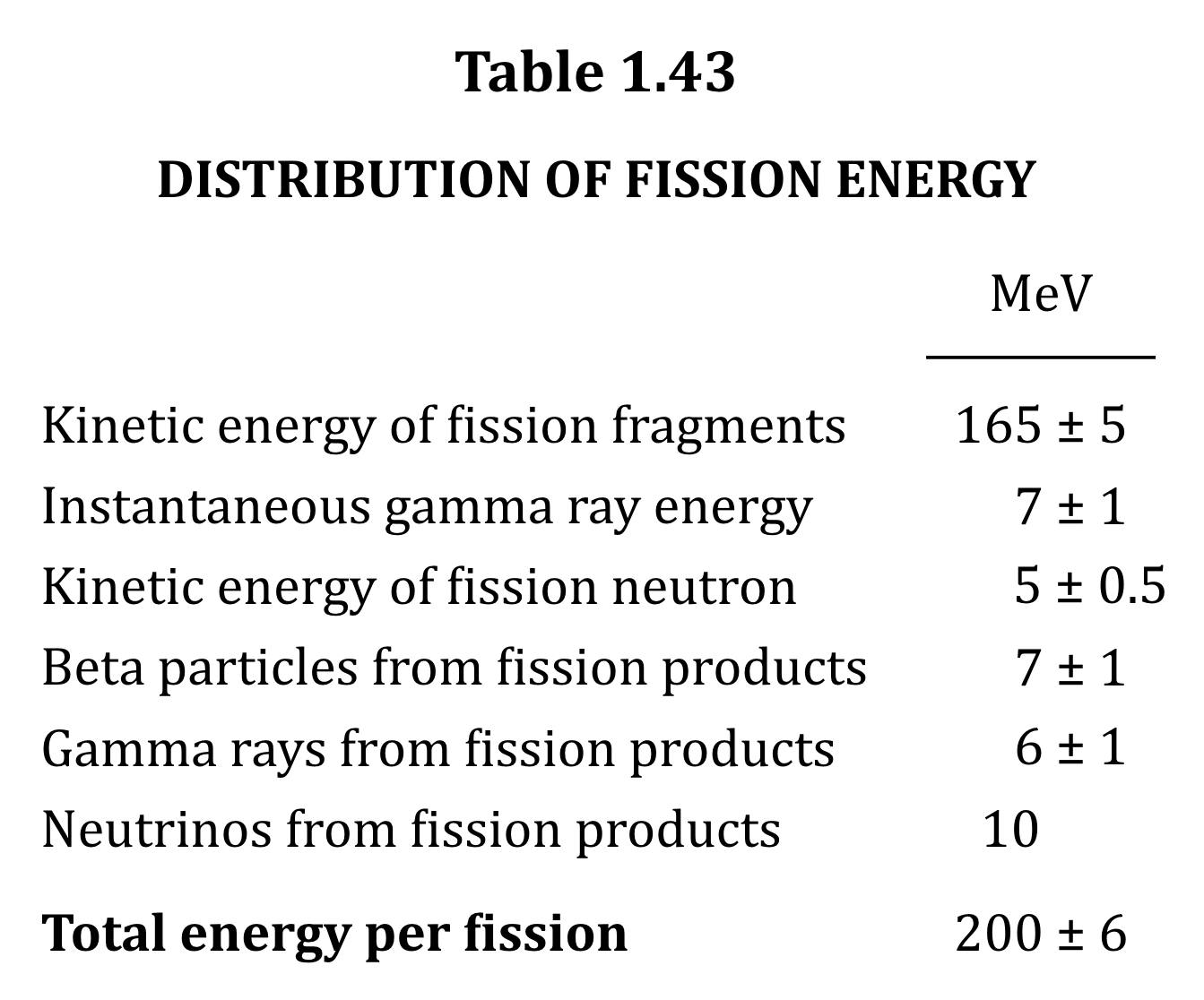
Look at the way it’s all supposed to line up on the ± and one number doesn’t even have a ± and that decimal is just hanging out there in space like it’s no big deal.  LOOK AT IT.

Some other things weren’t easy.  The data tables, for example, have a tendency to align columns on the decimal place, even when most but not all of the numbers are integers.  Long, long ago, it was proposed that text-align be allowed a string value, something like text-align: '.', which you could then apply to a table column and have everything line up on that character.  For a variety of reasons, this was never implemented, a fact which frosts my windows to this day.  In general, I mean, though particularly so for this project.  The lack of it made keeping the presentation historically accurate a right pain, one I may get around to writing about, if I ever overcome my shame.  [Editor’s note: he overcame that shame.]

There are two things about the book that we deliberately chose not to faithfully recreate.  The first is the font face.  My best guess is that the book was typeset using something from the Century family, possibly Century Schoolbook (the New version of which was a particular favorite of mine in college).  The very-widely-installed Cambria seems fairly similar, at least to my admittedly untrained eye, and furthermore was designed specifically for screen media, so I went with body text styling no more complicated than this:

body {
	font: 1em/1.35 Cambria, Times, serif;
	hyphens: auto;
}

I suppose I could have tracked down a free version of Century and used it as a custom font, but I couldn’t justify the performance cost in both download and rendering speed to myself and any future readers.  And the result really did seem close enough to the original to accept.

The second thing we didn’t recreate is the printed-page layout, which is two-column.  That sort of layout can work very well on the book page; it almost always stinks on a Web page.  Thus, the content of the book is rendered online in a single column.  The exceptions are the chapter-ending Bibliography sections and the book’s Index, both of which contain content compact and granular enough that we could get away with the original layout.

There’s a lot more I could say about how this style or that pattern came about, and maybe someday I will, but for now let me leave you with this: all these decisions are subject to change, and open to input.  If you come up with a superior markup scheme for any of the bits of the book, we’re happy to look at pull requests or issues, and to act on them.  It is, as we say in our preface to the online edition, a living project.

We also hope that, by laying bare the grim reality of these horrific weapons, we can contribute in some small way to making them a dead and buried technology.


Not a Teen

Published 3 years, 6 months past

She would have become a teenager this morning, but she didn’t.  She would have had her bat mitzvah ceremony this past weekend, as her best friend in the world actually did, but she didn’t.  So many more nevers.

I find myself not wanting to talk about it at all, and also wanting to talk about it all the time.  This hole, this void, this screaming silent tear in the world that so many can feel but nobody outside that circle can see.  How do I make someone who didn’t know her understand?  Why would I bring it up with someone who already knows?  Where can I go to fill it, to make things complete?

Nowhere, of course.  No where, no why, no how.

They tell you that some milestones will be hard to accept, when you become a parent.

They don’t tell you how much harder it will be to accept the milestones that were never passed.


Ancestors and Descendants

Published 3 years, 6 months past

After my post the other day about how I got started with CSS 25 years ago, I found myself reflecting on just how far CSS itself has come over all those years.  We went from a multi-year agony of incompatible layout models to the tipping point of April 2017, when four major Grid implementations shipped in as many weeks, and were very nearly 100% consistent with each other.  I expressed delight and astonishment at the time, but it still, to this day, amazes me.  Because that’s not what it was like when I started out.  At all.

I know it’s still fashionable to complain about how CSS is all janky and weird and unapproachable, but child, the wrinkles of today are a sunny park stroll compared to the jagged icebound cliff we faced at the dawn of CSS.  Just a few examples, from waaaaay back in the day:

  • In the initial CSS implementation by Netscape Navigator 4, padding was sometimes a void.  What I mean is, you could give an element a background color, and you could set a border, but if you adding any padding, in some situations it wouldn’t take on the background color, allowing the background of the parent element to show through.  Today, we can recreate that effect like so:
    border: 3px solid red;
    padding: 0.5em;
    background-color: cornflowerblue;
    background-clip: content-box;
    

    Padding as a void.

    But we didn’t have background-clip in those days, and backgrounds weren’t supposed to act like that.  It was just a bug that got fixed a few versions later. (It was easier to get browsers to fix bugs in those days, because the web was a lot smaller, and so were the stakes.)  Until that happened, if you wanted a box with border, background, padding, and content in Navigator, you wrapped a <div> inside another <div>, then applied the border and background to the outer and the padding (or a margin, at that point it didn’t matter) to the inner.
  • In another early Navigator 4 version, pica math was inverted: Instead of 12 points per pica, it was set to 12 picas per point — so 12pt equated to 144pc instead of 1pc.  Oops.
  • Navigator 4’s handling of color values was another fun bit of bizarreness.  It would try to parse any string as if it were hexadecimal, but it did so in this weird way that meant if you declared color: inherit it would render in, as one person put it, “monkey-vomit green”.
  • Internet Explorer for Windows started out by only tiling background images down and to the right.  Which was fine if you left the origin image in the top left corner, but as soon as you moved it with background-position, the top and left sides of the element just… wouldn’t have any background.  Sort of like Navigator’s padding void!
  • At one point, IE/Win (as we called it then) just flat out refused to implement background-position: fixed.  I asked someone on that team point blank if they’d ever do it, and got just laughter and then, “Ah no.” (Eventually they relented, opening the door for me to create complexspiral and complexspiral distorted.)
  • For that matter, IE/Win didn’t inherit font sizes into tables.  Which would be annoying even today, but in the era of still needing tables to do page-level layout, it was a real problem.
  • IE/Win had so many layout bugs, there were whole sites dedicated to cataloging and explaining them.  Some readers will remember, and probably shudder to do so, the Three-Pixel Text Jog, the Phantom Box Bug, the Peekaboo Bug, and more.  Or, for that matter, hasLayout/zoom.
  • And perhaps most famous of all, Netscape and Opera implemented the W3C box model (2021 equivalent: box-sizing: content-box) while Microsoft implemented an alternative model (2021 equivalent: box-sizing: border-box), which meant apparently simple CSS meant to size elements would yield different results in different browsers.  Possibly vastly different, depending on the size of the padding and so on.  Which model is more sensible or intuitive doesn’t actually matter here: the inconsistency literally threatened the survival of CSS itself.  Neither side was willing to change to match the other — “we have customers!” was the cry — and nobody could agree on a set of new properties to replace height and width.  It took the invention of DOCTYPE switching to rescue CSS from the deadlock, which in turn helped set the stage for layout-behavior properties like box-sizing.

I could go on.  I didn’t even touch on Opera’s bugs, for example.  There was just so much that was wrong.  Enough so that in a fantastic bit of code aikido, Tantek turned browsers’ parsing bugs against them, redirecting those failures into ways to conditionally deliver specific CSS rules to the browsers that needed them.  A non-JS, non-DOCTYPE form of browser sniffing, if you like — one of the earliest progenitors of feature queries.

I said DOCTYPE switching saved CSS, and that’s true, but it’s not the whole truth.  So did the Web Standards Project, WaSP for short.  A group of volunteers, sick of the chaotic landscape of browser incompatibilities (some intentional) and the extra time and cost of dealing with them, who made the case to developers, browser makers, and the tech press that there was a better way, one where browsers were compatible on the basics like W3C specifications, and could compete on other features.  It was a long, wearying, sometimes frustrating, often derided campaign, but it worked.

The state of the web today, with its vast capability and wide compatibility, owes a great deal to the WaSP and its allies within browser teams.  I remember the time that someone working on a browser — I won’t say which one, or who it was — called me to discuss the way the WaSP was treating their browser. “I want you to be tougher on us,” they said, surprising the hell out of me. “If we can point to outside groups taking us to task for falling short, we can make the case internally to get more resources.”  That was when I fully grasped that corporations aren’t monoliths, and formulated my version of Hanlon’s Razor: “Never ascribe to malice that which is adequately explained by resource constraints.”

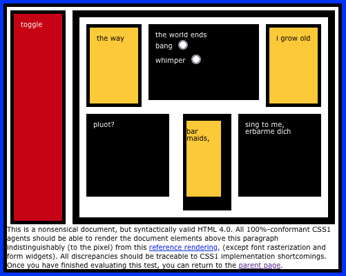
The original Acid Test.

In order to back up what we said when we took browsers to task, we needed test cases.  This not only gave the CSS1 Test Suite a place of importance, but also the tests the WaSP’s CSS Action Committee (aka the CSS Samurai) devised.  The most famous of these is the first CSS Acid Test, which was added to the CSS1 Test Suite and was even used as an Easter egg in Internet Explorer 5 for Macintosh.

The need for testing, whether acid or basic, lives on in the Web Platform Tests, or WPT for short.  These tests form a vital link in the development of the web.  They allow specification authors to create reference results for the rules in those specifications, and they allow browser makers to see if the code they’re writing yields the correct results.  Sometimes, an implementation fails a test and the implementor can’t figure out why, which leads to a discussion with the authors of the specification, and that can lead to clarifications of the specification, or to fixing flawed tests, or even to both.  Realize just how harmonious browser support for HTML and CSS is these days, and know that WPT deserves a big part of the credit for that harmony.

As much as the Web Standards Project set us on the right path, the Web Platform Tests keep us on that path.  And I can’t lie, I feel like the WPT is to the CSS1 Test Suite much like feature queries are to those old CSS parser hacks.  The latter are much greater and more powerful than than the former, but there’s an evolutionary line that connects them.  Forerunners and inheritors.  Ancestors and descendants.

It’s been a real privilege to be present as CSS first emerged, to watch as it’s developed into the powerhouse it is today, and to be a part of that story — a story that is, I believe, far from over.  There are still many ways for CSS to develop, and still so many things we have yet to discover in its feature set.  It’s still an entrancing language, and I hope I get to be entranced for another 25 years.

Thanks to Brian Kardell, Jenn Lukas, and Melanie Sumner for their input and suggestions.


25 Years of CSS

Published 3 years, 7 months past

It was the morning of Tuesday, May 7th and I was sitting in the Ambroisie conference room of the CNIT in Paris, France having my mind repeatedly blown by an up-and-coming web technology called “Cascading Style Sheets”, 25 years ago this month.

I’d been the Webmaster at Case Western Reserve University for just over two years at that point, and although I was aware of table-driven layout, I’d resisted using it for the main campus site.  All those table tags just felt… wrong.  Icky.  And yet, I could readily see how not using tables hampered my layout options.  I’d been holding out for something better, but increasingly unsure how much longer I could wait.

Having successfully talked the university into paying my way to Paris to attend WWW5, partly by having a paper accepted for presentation, I was now sitting in the W3C track of the conference, seeing examples of CSS working in a browser, and it just felt… right.  When I saw a single word turned a rich blue and 100-point size with just a single element and a few simple rules, I was utterly hooked.  I still remember the buzzing tingle of excitement that encircled my head as I felt like I was seeing a real shift in the web’s power, a major leap forward, and exactly what I’d been holding out for.

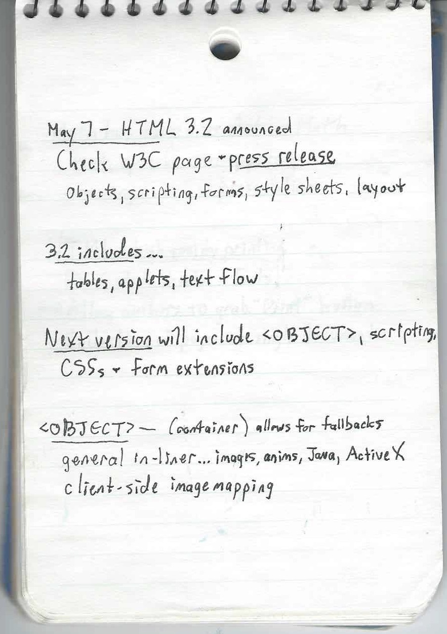
Page 4, HTML 3.2.

Looking back at my hand-written notes (laptops were heavy, bulky, battery-poor, and expensive in those days, so I didn’t bother taking one with me) from the conference, which I still have, I find a lot that interests me.  HTTP 1.1 and HTML 3.2 were announced, or at least explained in detail, at that conference.  I took several notes on the brand-new <OBJECT> element and wrote “CENTER is in!”, which I think was an expression of excitement.  Ah, to be so young and foolish again.

There are other tidbits: a claim that “standards will trail innovation” — something that I feel has really only happened in the past decade or so — and that “Math has moved to ActiveMath”, the latter of which is a term I freely admit I not only forgot, but still can’t recall in any way whatsoever.

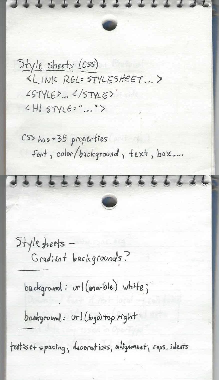
My first impressions of CSS, split for no clear reason across two pages.

But I did record that CSS had about 35 properties, and that you could associate it with markup using <LINK REL=STYLESHEET>, <STYLE>…</STYLE>, or <H1 STYLE="…">.  There’s a question — “Gradient backgrounds?” — that I can’t remember any longer if it was a note to myself to check later, or something that was floated as a possibility during the talk.  I did take notes on image backgrounds, text spacing, indents (which I managed to misspell), and more.

What I didn’t know at the time was that CSS was still largely vaporware.  Implementations were coming, sure, but the demos I’d seen were very narrowly chosen and browser support was minimal at best, not to mention wildly inconsistent.  I didn’t discover any of this until I got back home and started experimenting with the language.  With a printed copy of the CSS1 specification next to me, I kept trying things that seemed like they should work, and they didn’t.  It didn’t matter if I was using the market-dominating behemoth that was Netscape Navigator or the scrappy, fringe-niche new kid Internet Explorer: very little seemed to line up with the specification, and almost nothing worked consistently across the browsers.

So I started creating little test pages, tackling a single property on each page with one test per value (or value type), each just a simple assertion of what should be rendered along with a copy of the CSS used on the page.  Over time, my completionist streak drove me to expand this smattering of tests to cover everything in CSS1, and the perfectionist in me put in the effort to make it easy to navigate.  That way, when a new browser version came out, I could run it through the whole suite of tests and see what had changed and make note of it.

Eventually, those tests became the CSS1 Test Suite, and the way it looks today is pretty much how I built it.  Some tests were expanded, revised, and added, plus it eventually all got poured into a basic test harness that I think someone else wrote, but most of the tests — and the overall visual design — were my work, color-blindness insensitivity and all.  Those tests are basically what got me into the Working Group as an Invited Expert, way back in the day.

Before that happened, though, with all those tests in hand, I was able to compile CSS browser support information into a big color-coded table, which I published on the CWRU web site (remember, I was Webmaster) and made freely available to all.  The support data was stored in a large FileMaker Pro database, with custom dropdown fields to enter the Y/N/P/B values and lots of fields for me to enter template fragments so that I could export to HTML.  That support chart eventually migrated to the late Web Review, where it came to be known as “the Mastergrid”, a term I find funny in retrospect because grid layout was still two decades in the future, and anyway, it was just a large and heavily styled data table.  Because I wasn’t against tables for tabular data.  I just didn’t like the idea of using them solely for layout purposes.

You can see one of the later versions of Mastergrid in the Wayback Machine, with its heavily classed and yet still endearingly clumsy markup.  My work maintaining the Mastergrid, and articles I wrote for Web Review, led to my first book for O’Reilly (currently in its fourth edition), which led to my being asked to write other books and speak at conferences, which led to my deciding to co-found a conference… and a number of other things besides.

And it all kicked off 25 years ago this month in a conference room in Paris, May 7th, 1996.  What a journey it’s been.  I wonder now, in the latter half of my life, what CSS — what the web itself — will look like in another 25 years.


First Month at Igalia

Published 3 years, 9 months past

Today marks one month at Igalia.  It’s been a lot, and there’s more to come, but it’s been a really great experience.  I get to do things I really enjoy and value, and Igalia supports and encourages all of it without trying to steer me in specific directions.  I’ve been incredibly lucky to experience that kind of working environment twice in my life — and the other one was an outfit I helped create.

Here’s a summary of what I’ve been up to:

  • Generally got up to speed on what Igalia is working on (spoiler: a lot).
  • Redesigned parts of wpewebkit.org, fixed a few outstanding bugs, edited most of the rest. (The site runs on 11ty, so I’ve been learning that as well.)
  • Wrote a bunch of CSS tests/demos that will form the basis for other works, like articles and videos.
  • Drafted a few of said articles.  As I write this, two are very close to being complete, and a third is almost ready for editing.
  • Edited some pages on the Mozilla Developer Network (MDN), clarifying or upgrading text in some places and replacing unclear examples in others.
  • Joined the Open Web Docs Steering Committee.
  • Reviewed various specs and proposals (e.g., Miriam’s very interesting @scope proposal).

And that’s not all!  Here’s what I have planned for the next few months:

  • More contributions to MDN, much of it in the CSS space, but also branching out into documenting some up-and-coming APIs in areas that are fairly new to me.  (Details to come!)
  • Contributions to the Web Platform Tests (WPT), once I get familiar with how that process is structured.
  • Articles on topics that will include (but are not limited to!) gaps in CSS, logical properties, and styling based on writing direction.  I haven’t actually settled on outlets for those yet, so if you’d be interested in publishing any of them, hit me up.  I usually aim for about a thousand words, including example markup and CSS.
  • Very likely will rejoin the CSS Working Group after a (mumblecough)-year absence.
  • Assembling a Raspberry Pi system to test out WPEWebKit in its native, embedded environment and get a handle on how to create a “setting up WPEWebKit for total embedded-device noobs”, of which I am one.

That last one will be an entirely new area for me, as I’ve never really worked with an embedded-device browser before.  WPEWebKit is a WebKit port, actually the official WebKit port for embedded devices, and as such is aggressively tuned for performance and low resource demand.  I’m really looking forward to not only seeing what it’s like to use it, but also how I might be able to leverage it into some interesting projects.

WPEWebKit is one of the reasons why Igalia is such a big contributor to WebKit, helping drive its standards support forward and raise its interoperability with other browser engines.  There’s a thread of self-interest there: a better WebKit means a better WPEWebKit, which means more capable embedded devices for Igalia’s clients.  But after a month on the inside, I feel comfortable saying most of Igalia’s commitment to interoperability is philosophical in nature — they truly believe that more consistency and capability in web browsers benefits everyone.  As in, THIS IS FOR EVERYONE.

And to go along with that, more knowledge and awareness is seen as an unvarnished good, which is why they’re having me working on MDN content.  To that end, I’m putting out an invitation here and now: if you come across a page on MDN about CSS or HTML that confuses you, or seems inaccurate, or just doesn’t have much information at all, please get in touch to let me know, particularly if you are not a native English speaker.

I can’t offer translation services, unfortunately, but I can do my best to make the English content of MDN as clear as possible.  Sometimes, what makes sense to a native English speaker is obscure or unclear to others.  So while this offer is open to everyone, don’t hold back if you’re struggling to parse the English.  It’s more likely the English is unclear and imprecise, and I’d like to erase that barrier if I can.

The best way to submit a report is to send me email with [MDN] and the URL of the page you’re writing about in the subject line.  If you’re writing about a collection of pages, put the URLs into the email body rather than the subject line, but please keep the [MDN] in the subject so I can track it more easily.  You can also ping me on Twitter, though I’ll probably ask you to email me so I don’t lose track of the report.  Just FYI.

I feel like there was more, but this is getting long enough and anyway, it already seems like a lot.  I can’t wait to share more with you in the coming months!


Browse the Archive

Earlier Entries

Later Entries