Posts in the Tools Category

WordPress Adminimize and Latest Tweet Plugins

Published 16 years, 5 months past

Just because the world hasn’t suffered enough bad PHP coding, I released two WordPress plugins today.  One pares down some of the admin UI, and the other is a Twitter plugin.  Because the world doesn’t have enough of those, either.  You can find links to them on my WordPress Plugins and Hacks (but I repeat myself) page, or if you can go straight to their respective pages, which I’ll link here in just a second.

Okay, second’s up!

MW Adminimize (currently v0.5)

This plugin pares down the page-topping links interface that shows up on every WordPress administration page.  I got tired of seeing my blog name in Big Huge Letters all the time, and I kept forgetting that the “Dashboard” link was hidden up in that black bar.  So I fiddled with some arrays and wrote some CSS, and got something that chews up less screen real estate while also being easier for me to use.  Maybe you’ll feel the same, in which case, enjoy the plugin.

In addition to that, I pared down some of the elements of the “Write Post” page so that they took up a bit less space, and compressed the stuff around the post title’s input field.  Those styles are marginally less stable and may cause weirdness for you.  If so, sorry.  Let me know what goes south and I’ll try to get it fixed in a future version.

Oh, and I also included a CSS rule that makes the background shading of moderated comments more obvious, though not in my usual eye-scarring fashion.  It’s just a little darker and notably redder.  That doesn’t have much of anything to do with minimizing the admin UI, but I thought it was a huge improvement.  I might take it out in a future version if the crowd shouts otherwise.

MW Latest Tweet (currently v1.0)

This one does what you’d probably guess: shows the latest tweet.  Why not just use something like Twitter Tools?  Actually, I tweeted about that.  A further survey of the options available turned up nothing that was quite what I wanted.  So of course I started hacking away.

The basic mechanism is that any time a page that calls this plugin is loaded, it either returns the last-cached tweet or asks Twitter for the latest tweets so it can cache the latest of them.  If Twitter fails to respond (I know, what are the odds?), you still get the cached tweet.  This is similar to SimpleTwitter, from which I took much inspiration, but is more advanced in a number of ways.  Among the options I wanted to have and thus created was having “human time” intervals as an option, and also the ability to filter out @replies (because I personally wanted to display my latest broadcast tweet, not my latest reply).  While I was at it, I decided I’d throw in the ability to define your own XHTML output, so that if the plugin failed there wouldn’t be partial or mangled markup shoved into your pages.  Also, since I cache the whole of the latest tweet, you have all kinds of stuff you can output should you so desire.  It’s all documented on the plugin’s page.

This is not a widget, because I’ve never written one and didn’t have time to learn (due to all the time I was burning just trying to write the plugin).  You have to edit your template/web page PHP in order to call it.  That’s just the kind of DIY guy I fly.  Er, I am.

Also, I’m a wee tiny bit proud of how I styled the labels on the plugin’s Settings page.  I’ll probably write that up in a separate post.

That’s about it.  If anything goes wrong or is unclear, please do let me know in the comments.  Share and enjoy!


Expressive Sculptor

Published 16 years, 8 months past

For those of you using Microsoft Expression Web, a free pre-release trial version of CSS Sculptor for Expression Web was announced by the WebAssist folks on Wednesday at MIX08.  So now you don’t have to put up with those snooty Dreamweaver users throwing you the mëtäl hörns every chance they get—throw ’em right back!  Røck!

If you’re curious about CSS Sculptor, I posted in some detail about it when it was first released in August 2007, and there’s of course plenty of enthusiastic copy about it on the WebAssist site.

One thing that’s different about the Expression version as compared to the Dreamweaver version is that it doesn’t have an “Apply” button to apply the input CSS ito the preview window.  Instead, changes are instantly reflected in the little preview.  It’ll be interesting to see how users react to that, since it could mean that the previewed design shatters as the CSS is updated, and then snaps back together upon further changes.  Is that good or bad tool usability?  Hard to say; it could scare people into undoing the shatter-change and never pushing forward, but it could also help users more quickly gain a deeper understanding of CSS by seeing how things come apart and then go back together.  I guess we’ll find out!


Manhattan Problem

Published 16 years, 9 months past

It’s not every day I uncover a case involving the botched theft of information about nuclear weapons.

Here’s how it went down: in the infosthetics feed was an entry about a video regarding nuclear stockpiles around the world and the effects of a nuclear explosion in New York City.  The video was produced by Chimp on a Chain for Good Magazine.

That’s a long-standing area of interest for me, so I watched it.  When I got to the New York City portion, something started to bother me beyond the obvious horror of the scenario.  The point of detonation, the explosive yield, the elapsed-time intervals, the radius distances—all seemed very familiar, like I’d seen them somewhere before.  And I had.

They were nearly all taken verbatim from the New York City scenario found at the Atomic Archive.  I could find only two differences.  The first is that the total death toll given in the video is slightly higher than that in the Atomic Archive’s scenario.  Otherwise, all the numbers matched up.

The second difference is really a major error on the part of the video’s makers: they dramatically under-represent the areas of damage.  For example, the ten-second ring’s (found at 2:33 in the movie) radius is labeled with the correct distance (2.5 miles) but the circle placed on the map is much, much too small to be 2.5 miles in radius.  The circle doesn’t even cover the breadth of Manhattan Island, whereas an accurate plot would have it stretch across the Hudson River on both sides into New Jersey and Long Island.  You can see this in part 5 of the Atomic Archive’s scenario, or on a HYDEsim plot of the same scenario.

The video seriously misrepresents the area of damage that would result from such an incident, making it appear much smaller than it would be, and I just can’t fathom how or why they would get that so wrong.  Even assuming they mixed up the meanings of “radius” and “diameter” doesn’t appear to explain it.  The ring distances shown correspond to a three-kiloton explosion at most, not to 150KT.

That’s the botched part.  So where’s the theft?  There is no credit whatsoever given in the video for the material’s source.  There is a reference to the Archive on the video’s page at Good in the “Resources” box, but the material in the video has been used without permission—I checked this with the custodian of the Archive—as required by the site’s policy.  Even if one could argue this is a case of not needing permission on non-profit grounds, attribution is still required.

It would almost be worth subscribing to Good so that 100% of my payment could go to the non-profit of my choice, as the site promises, except I’m limited to their choices of non-profits and none of them appear to be charged with educating magazine publishers or video artists about the niceties of copyright law, intellectual property rights, or even just plain common courtesy.


CSS Tools: Reset and Diagnostics

Published 16 years, 9 months past

I’ve hinted and teased and promised, and I’ve yet to make good on any of it.  I’m sorry.  Can I make it up to you?

Okay, then, here you go: a permanent home for my reset styles.  It takes up residence in a new “CSS” subsection of the Toolbox section of the site, along with my efforts to create a generic set of diagnostic styles.  In the case of the resets, I’ll increment the version number and date whenever I make changes, and probably maintain an archive of previous versions.  Not that I expect that to happen with any frequency, but you never know.

The diagnostics are a lot more experimental and thus aren’t so formal as to have things like version numbers.  If I change anything of specific interest there, I’ll try to write a post about it.  I should get around to writing about the shown-in-page stylesheet one of these days, though I figure anyone can view source and work out the particulars without too much effort.


In Search of Q

Published 17 years, 2 weeks past

In an effort to get a handle on my taskflow, I went looking for an organizer application.  So far as I can tell, what I want doesn’t exist, but maybe someone can point me to it.

What I really want is a push queue for documents and other data fragments.  I’ll call it “Q”, both for the obvious phonic match as well as to score a little ST:TNG joke plus make a Cleveland arena reference.  The latter two work because I sort of envision the application as being a very powerful being as well as a large gathering place for data.

The way I envision it, I drag a file onto the main Q window and it’s added to the general pool.  Every item in Q can be labeled, tagged, commented, and otherwise meta’d half to death.  The queue can be sorted or filtered on any number of things—file creation or modification date, Q addition date, file name, containing folder, tags, labels, and so forth.  Also, every item can be assigned a due date.

When I double-click on anything in Q, it opens the original file just as if I’d double-clicked its Finder icon.  (I’m an OS X user, but translate “Finder icon” to whatever the equivalent words are in your OS of choice.)  So really, Q is maintaining a pool of aliases to the original files, plus any associated metadata.  In that sense, it’s like iTunes set to not copy added music to the iTunes Music folder in your home directory.  Yes, some people run it that way.  And like iTunes, the ability to create smart lists based on tags and comments and such would be really awesome.

I’d find Q deeply useful because as new tasks come in/up, I could drag in whatever file(s) relate to those tasks so that I don’t lose track of what I have to do, quickly tag them and set a due date, and continue with whatever I was working on.  There’s room for tons of even more useful features like synchronization across multiple computers, the ability to accept any fragment of data at all as opposed to files, and more, but the core need is a task queue.

To illustrate this with some examples from my recent workflow, I would drag in a copy or two of the IRS W-9 form, a couple of e-mail messages, an invoice, and a Word document containing a set of interview questions.  The W-9s would get tagged by the clients’ names, the invoice would be tagged and flagged, and so on.  The real key here is that they’d be add-sorted by default, so I can work on them first-come-first-served.  Of course, other approaches would be possible with other sorts and filtering.

It seems like, with all the GTD mania floating around, someone would have come up with this solution already, but my searches have so far been fruitless.  I tried a couple of applications that seemed like they might be close to what I want, but they weren’t.  Am I just using the wrong search terms, or is this something that just doesn’t exist yet?


Another Soul Lost to SketchUp

Published 17 years, 2 months past

Hitting a link shared by Unstoppabot, who really needs to get around to fixing his feed linking policy (“View this site”?  Lame!), I was seized with another spasm of appreciation for the deliciousness that is SketchUp.

I did a moderate amount of 3D modeling back in the day.  The specific day in question would be the one where we all thought that images of rendered 3D models and, whenever possible, blobs of text were the absolute last word in Great Web Design.  Remember that?  Wasn’t it fantastic?  When every page title could be a bunch of extruded and beveled sans-serif letters viewed slightly from above, with the whole mess of text angled away from the observer?

Good times.

So anyway, while I was cranking out renderings of page title text and university logos, I also spent some time creating scenes of other stuff.  You can find some of the results if you dig deeply enough here on meyerweb, but that’s not my point.  What I’m trying to say is that I enjoy a bit o’ three dee more than most, and have some knowledge of how difficult it can be to construct models.

When I first heard about SketchUp, I was intrigued but didn’t really buy into all the hype.  It couldn’t be that easy, could it?  And then I watched someone using it—at An Event Apart, as it happens; and no, it wasn’t one of the attendees—and was captivated.  I downloaded the installer while I was sitting there, watching him create and modify shapes as easily as sketching them on paper.  And then I left it uninstalled, because I was afraid of what it would do to my free time.

A few days ago, I finally broke down.  I actually did have a legitimate reason to install and use it, a really good one, but of course I’d been waiting for any reasonable pretense to launch the .dmg and make with the modeling.  So I did.

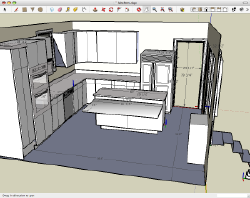
Color me deeply impressed.  While you’re at it, add some heavy tints of addicted.  I started by modeling our kitchen, and now I want to do the whole frickin’ house.  I’m starting to eye local landmarks for recreation and contribution to the Warehouse and Google Earth.

I don’t have time for this.  I need help.  Stop me before I model again!


Diagnostic Styling

Published 17 years, 2 months past

On stage at An Event Apart Chicago, I made reference to recent efforts I’ve been making to develop a set of “diagnostic” styles.  I’d hoped to have them ready for presentation in Chicago, but didn’t get it done in time.

Well, they’re still not really done, but as I’ve now torn them apart and rebuilt them three or four times, with no real end to that cycle in sight, it’s time for me to get them off of my hard drive and into the public eye.  It’s a little bit complicated, so rather than post the whole thing in this entry, I’m going to link to a demonstration page.  I first want to say a few things about it, though.

The primary goal here is to have a set of rules that can be applied during the development phase of a new layout.  These rules’ aim is to visually highlight problems in the markup.  For example, here’s one of the rules:

a[href="#"] {background: lime;}
a[href=""] {background: fuchsia;}

That brings some eye-watering attention to any link that has an empty href, or is (most likely) being used as a JavaScript trigger with no fallback.

Where things got tricky was when I wanted to do things like higlight images that didn’t have alt or title attributes.  In a perfect CSS3 world, I could just say img:not(img[alt]) to select non-alted images.  At least, I think that’s what I would say—:not() syntax makes my temples throb.  Since I was developing these with the idea of releasing them to a more general development audience, though, I decided to use regular old non-:not selectors.

So what I ended up doing, in slightly simplified form, was this sort of thing:

img {outline: 5px solid red;}
img[alt][title] {outline-width: 0;}
img[alt] {outline-color: fuchsia;}
img[alt], img[title] {outline-style: double;}
img[alt=""][title], img[alt][title=""] {outline-width: 3px;}
img[alt=""][title=""] {outline-style: dotted;}

The logic works out like so:

  1. Set all images to have a big red outline.
  2. If an image has both alt and title attributes, set the outline width to zero.
  3. If an image has an alt attribute, set the outline color to fuchsia.  This means the outline of any image that doesn’t have an alt attribute will stay red.
  4. As long as an image has either an alt or a title attribute, make its outline style double.
  5. If an image has an empty alt with any kind of title, or vice versa, make the outline’s width three pixels.
  6. If an image’s alt and title attributes are both empty, then make the outline dotted.

Whew.  Maybe I piled a few too many conditions in there, but I wanted to get some finer granularity on the results, which you can see demonstrated (along with several other things, like highlighting table headers without scope attributes and tables without summary attributes) at the diagnostic demonstration page.  On that page, you’ll see a number of examples and the style sheet that drives them all.  If it’s getting in the way of seeing what’s going on, move the mouse over it to mostly clear it away without actually removing it.  Mouse back out to bring it back.  (Maybe I should reverse those states—what do you think?)

Admittedly, much of what these styles do can be replicated with tools like the Web Developer Toolbar.  The advantage I find with writing my own diagnostic styles is that I can tune them to present exactly the way I want them.  Outlining deprecated elements is fine, but what if I’d rather make them lime-green on cyan to really drive the point into my optic nerves?

Anyway, I don’t for an instant think that these constitute a replacement for the WDT.  They’re just another handy tool to have in the toolbox.

A final note: when actually using diagnostic styles, all of the declarations should be marked !important so as to ensure their application.  I left those directives out of the demo page for clarity’s sake.  If you’re going to use diagnostic styles of this sort in your own projects, remember that you’ll need to add them.

I’m putting these out for comment, suggestions, and general community improvement.  Anyone see things we could add or upgrade?  Let us know!


Jackals and HYDEsim

Published 18 years, 1 month past

Long-time readers (and Jeremy) probably remember HYDEsim, the big-boom ‘simulator’ I hacked together using the Google Maps API and some information in my personal reading library.

Well, with North Korea setting off something that might have been a nuclear device, it’s starting to show up in the darndest places.  Everyone’s favorite millenial talk show host, Glenn Beck, not only mentioned it on his radio program this past Monday, but also put a link on the main page of his site for a couple of days.  Then it got Farked.  I suppose it’s only a matter of time now before it gets Slashdotted as well.

With the increased attention, some old criticisms have arisen, as well as some misunderstandings.  For example, on Fark, someone said:

I thought it was funny how people are playing with this and think they were “safe” if they weren’t in the circle.

Here’s a mockup I did of the kind of blast damage you could expect from a single 1980’s era Russian ICBM carrying 10 MIRV warheads, each capable of 750KT yield.

Oh my yes.  That’s something that the HYDEsim code can theoretically support, since every detonation point is an object and there’s no limit on the number of objects you can have, but I never managed to add this capability.  That’s because trying to figure out the UI for placing the MIRV impact points broke my head, and when I considered how to set all that in the URI parameters (for direct linking), a tiny wisp of smoke curled out of my left ear.  Still, one of these days I should probably at least add a “MIRV ring impact” option so the young’n’s can get an idea of what had us all scared back in the old days.

The interesting challenge is that a strategic nuclear strike of that variety is going to involve a whole bunch of optimum-altitude air bursts.  HYDEsim takes the simpler—and also, in this darkened day and age, more realistic—approach of calculating the effects of a ground burst.  The difference is in no sense trivial: a ground burst has a lot of energy, both thermal and radiological, absorbed by the ground (oddly enough!).  On the other hand, its highest overpressure distances are actually greater.

This is because shock energy drops with distance, of course.  An optimum-altitude air burst would be a mile or two above the ground, so the highest pressures would be directly beneath the explosion, and would be smaller than if the same weapon exploded on the ground.  With an air burst there’s less ground and man-made clutter to attenuate the shock waves as they spread out, so the total area taking some degree of damage due to overpressure is actually greater.  (There are also very complex interactions between the shock waves in the air and those reflected off the ground, but those are way beyond my ability to simulate in JavaScript.)

Also, direct thermal radiation is spread over a much greater area with an air burst than with a ground burst—again, there’s less stuff in the way.  The amount of fallout depends on the “cleanliness” of the warhead, but for an air burst it can actually be expected to be less than a groundburst.

People also claim that radiological energy (X-rays, neutron radiation, gamma radiation, etc.) will be the deadliest factor of all.  Actually, it’s just the opposite, unless you’re discussing something like a neutron bomb.  The amount of harmful direct-effect radiation that comes directly from the explosion is far, far smaller than the thermal energy.  And yes, I know thermal radiation is direct-effect, but there’s a large practical difference between heat and other forms of radiation.

Put another way, if you’re close enough to an exploding nuclear warhead that the amount of radiation emitted by the explosion would ordinarily kill you, the odds are overwhelmingly high that the amount of shock wave and thermal energy arriving at your position will ensure that there won’t be time for you to worry about the radiation effects.  Or anything else, really.

Remember: I’m talking there about direct radiation, not the EMP or fallout.  That’s a whole separate problem, and one HYDEsim doesn’t address, to the apparent disgust of another Farker:

The site is useless without fallout and thermal damage.

Well, I don’t know about useless, but it’s admittedly not as representative of the totality of nuclear-weapons damage as it might otherwise be.  Of course, HYDEsim is not specifically about nuclear detonations, as I showed when I mapped the Hertfordshire oil refinery explosion and djsunkid mapped the Halifax explosion of 1917.  But I certainly admit that the vast majority of explosions in the range the tool covers are going to be from nuclear weapons.

The problem with mapping fallout is that it’s kind of weather dependent, just for starters; just a few miles-per-hour difference in wind speed can drastically alter the fallout pattern, and the position of the jet stream plays a role too.  Also, the amount of fallout is dependent on the kind of detonation—anyone who was paying attention during the Cold War will remember the difference between “dirty” and “clean” nuclear warheads.  (For those of you who came late: to get a “dirty” warhead, you configure a device to reduce the explosive power but generate a lot more fallout.)

Thermal effects are something I should add, but it’s trickier than you might expect.  There’s actually an area around the explosion where there are no fires, because the shock effects snuff them out.  Beyond that, there’s a ring of fire (cue Johnny Cash).  So it’s not nearly as simple as charting overpressure, which is itself not totally simple.

And then there’s there whole “how to combine thermal-effect and overpressure rings in a way that doesn’t become totally confusing” problem.  Get ambitious, and then you have the “plus the show fallout plume without making everything a total muddle” follow-on problem.  Ah well, life’s empty without a challenge, right?

Okay, so I went through all that and didn’t actually get to my point, which is this:  I’ve been rather fascinated to see how the tool gets used.  When it was first published, there was a very high percentage of the audience who just went, “Cooool!”.  That’s still the case.  It’s the same thing that draws eyes to a traffic accident; it’s horrible, but we still want to see.

However, I also got some pushback from conservative types:  how dare I publish such a thing, when it could only be useful to terrorists?!?!?  Rather than play to the audience and inform them that I simply hate freedom, I mentioned that it was desirable to have people like you and me better understand the threats we face.  It’s not like the terrorists can’t figure this stuff out anyway.

Now I’ve seen a bunch of people from the same ideological camp use HYDEsim to mock the North Koreans’ test, which apparently misfired and only achieved a yield of about 0.5KT.  Others have taken that figure and plotted it in American cities, giving some scale to the dimension of this particular threat.  Still others have done that, but with the yield the North Koreans had attempted to reach (thought to be 4KT), or even with yields up to 50KT.  In most cases, these last are shown in conjunction with commentary to the effect of “now do you understand why this is a problem?”.

This is why I do what I do, whether it’s write books or publish articles or speak at conferences or build tools or just post entries here:  to help people learn more about their world, and to help them share what they know and think and believe with others.  Sometimes that’s worth saying again, if only to remind myself.


Browse the Archive

Earlier Entries

Later Entries